
Design
From Figma to Production: Why Most Product Builds Go Wrong
Beautiful Figma designs are just the start. Discover the common pitfalls that derail digital product builds and how to bridge the gap between design vision and successful production.

Imagine the scene: a conference room, buzzing with excitement. A sleek, vibrant Figma prototype projects onto the screen, showcasing the next big digital product. Stakeholders nod, impressed. The user flows are intuitive, the aesthetics are stunning, and the vision is crystal clear. Everyone celebrates. "This is it," they think, "our product is practically built." Weeks turn into months. Development kicks off with enthusiasm. But then, a subtle shift begins.
The elegant interactions from Figma become "hard to implement." Real-world data fills the carefully crafted layouts, and suddenly, mobile screens break. Edge cases, once invisible in the ideal prototype, now rear their heads. Performance issues creep in. The polished design system feels rigid, not scalable. Developers interpret designs differently. Features drag on, taking far longer than expected. The final product, once a spitting image of the Figma file, starts to drift. Business requirements shift mid-build. Teams begin redesigning elements during development, adding more delays. Eventually, the question hangs heavy in the air, "Why doesn't the final product look or work like the design?" This common scenario highlights a critical challenge in product development: the journey from Figma to production, where most product builds go wrong.
Figma is an incredibly powerful tool. It allows product teams to visualize, iterate, and collaborate on designs with remarkable speed and clarity. It fosters innovation, enabling designers to craft beautiful, user-centric experiences. However, it is crucial to remember that Figma, for all its brilliance, is not the product itself. A Figma prototype represents an idealized, perfect-world experience. It's a blueprint, a vision. Production software, the actual digital product your users interact with, must contend with a much messier reality.
It navigates real users, live data, complex APIs, robust authentication, granular permissions, vast databases, network failures, empty states, loading states, and countless error conditions. It must perform across diverse devices, prioritize accessibility, maintain high performance, ensure security, and scale seamlessly. The gap between this idealized Figma vision and the complex demands of a real-world production environment is precisely where many digital product projects begin to break down, transforming excitement into frustration.

Figma Is Not the Finish Line
Many teams mistakenly treat designing screens as the same as designing a product. Screens, when populated with ideal, curated content, can look absolutely perfect. They shine under optimal conditions. But a successful product design anticipates the storm, not just the sunny day. What happens when the user has no data to display? What if the API fails to fetch information? How does a design gracefully handle a username that is unexpectedly long, overflowing its container? What if a list meant for a few items suddenly needs to display ten thousand records?
How does the system respond when a payment fails, or a user lacks the necessary permissions for an action? What if the user is offline, or makes a simple mistake in a form? These aren't hypothetical questions for a production application. They are everyday realities. Good product design, the kind that moves seamlessly from Figma to production, deeply considers and accounts for all these situations. It's about designing a resilient system, not just a static interface. It means thinking through the entire user journey, including all the detours, roadblocks, and unexpected turns.
This holistic approach ensures that the beautiful Figma mockups translate into a robust, reliable, and delightful experience for every user, under every conceivable circumstance. Without this foresight, even the most stunning designs can crumble under the weight of real-world complexity, leading to frustrating rebuilds and missed deadlines.
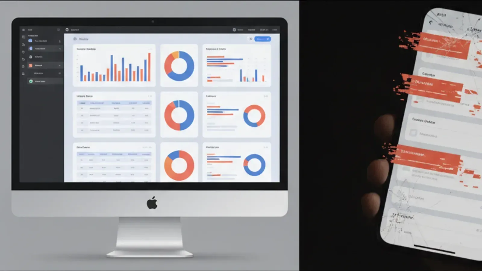
The 10 Most Common Reasons Products Break Between Design and Development
1. Designing for the Happy Path Only
What happens: Designers craft beautiful flows that perfectly illustrate the ideal user journey, assuming everything goes right. Users log in flawlessly, data loads instantly, and every transaction completes without a hitch. However, in the real application, users encounter errors, network timeouts, and unexpected data. The product then behaves awkwardly or breaks completely, as these scenarios were never considered in the design.
Why it happens: This often stems from a focus on showcasing the core functionality and vision, rather than the exhaustive details. Designers, often under tight deadlines, prioritize the primary user goals. They might not have the technical input or the time to map out every single edge case, error state, or alternative flow. The assumption is that developers will "figure it out" or that these issues are minor.
Business impact: Users get frustrated and abandon the product when faced with unforeseen errors or unresponsive screens. Support costs increase as users report common issues. The product feels incomplete and unreliable, damaging brand reputation and reducing user retention. Developers spend valuable time improvising solutions, leading to inconsistent user experiences and technical debt.
How to prevent it: Integrate engineering feedback much earlier in the design process. Conduct thorough user story mapping that includes failure scenarios and negative paths. Designers and developers should collaborate to identify all possible states, including empty states, loading states, success messages, and specific error messages. A comprehensive design system should include guidelines for handling these states consistently.
2. Developers Are Involved Too Late
What happens: A gorgeous set of designs is delivered to the engineering team. They start building, only to discover that key interactions are technically challenging, impossible, or would require significant refactoring of existing systems. This leads to substantial delays, compromise on the design vision, or costly reworks.
Why it happens: Design and engineering often operate in silos. Designers work to solve user problems and create appealing interfaces without early input on technical feasibility, database structures, or API limitations. Engineering is brought in only after designs are "finalized" and approved by stakeholders, making any proposed changes disruptive and expensive.
Business impact: Project timelines extend dramatically, burning through budget. Features may need to be simplified or cut due to technical constraints. The final product might deviate significantly from the approved designs, leading to dissatisfaction among stakeholders. It also fosters an "us vs. them" mentality between design and engineering, hindering overall team cohesion.
How to prevent it: Foster a culture where design and engineering are integrated from day one. Engineers should participate in brainstorming sessions, design critiques, and user story refinement. Early technical spikes or proof-of-concepts can validate complex interactions. Kraavon's approach of integrating strategy, design, and engineering as one team ensures continuous feedback and shared understanding throughout the entire product lifecycle. This early, continuous collaboration ensures that designs are not only beautiful but also buildable and performant.
3. No Design System
What happens: Every screen is designed as a standalone entity. As the product grows, inconsistencies emerge in typography, spacing, colors, and component behavior. Developers end up building unique components for similar UI elements, bloating the codebase and slowing down future development.
Why it happens: In the rush to launch, or due to a lack of strategic foresight, teams often overlook the need for a cohesive design system. Designers might pull components from various libraries or create new ones on the fly without a central source of truth. Without clear guidelines, developers improvise, leading to a fragmented user experience.
Business impact: Development time increases significantly because developers are constantly reinventing the wheel or fixing inconsistencies. The user experience becomes disjointed, making the product feel less professional and harder to learn. Maintenance costs rise due to a sprawling, unorganized codebase. Scaling the product with new features becomes a slow, painful process.
How to prevent it: Invest in building a foundational design system early in the product lifecycle. This system should include a clear style guide, a component library, and usage guidelines for both designers and developers. Tools like Figma facilitate this by allowing shared libraries. The design system should be a living document, evolving with the product. It acts as a single source of truth, ensuring consistency and accelerating development velocity.
4. Missing Responsive States
What happens: Designs look stunning on a desktop monitor, but when viewed on smaller mobile screens, tablets, or even oversized displays, layouts break, content overlaps, or key information becomes inaccessible. The user experience degrades rapidly across different devices.
Why it happens: Designers often focus predominantly on the primary target screen size, typically desktop, especially if early wireframes or user flows are optimized for larger displays. The complexities of responsive design, including breakpoints, fluid layouts, and mobile-first considerations, might not be fully explored or documented in the Figma files.
Business impact: A significant portion of users, often mobile users, have a poor experience, leading to high bounce rates and low engagement. The product fails to reach its full market potential if it cannot adapt to diverse viewing environments. Developers spend considerable time retrofitting responsive behavior, which is more complex and error-prone than designing for it from the start.
How to prevent it: Adopt a mobile-first or content-first approach to design. Design responsive layouts from the beginning, considering how content and components adapt across a range of screen sizes. Figma files should include specific designs or detailed annotations for various breakpoints. Designers and developers should collaborate closely to define responsive strategies and test them continuously on actual devices.
5. Missing Loading, Empty, and Error States
What happens: The product assumes perfect data and network conditions. When data is slow to load, a screen is empty, or an API call fails, users are left staring at blank screens, spinners that never resolve, or cryptic error messages. This creates confusion and frustration.
Why it happens: These "non-happy path" states are often considered secondary or are simply overlooked during the initial design phase, which prioritizes the core functionality with populated data. It's easy to forget that a product might start with no data, or that network conditions are often imperfect.
Business impact: Users perceive the product as slow, buggy, or broken, even when the underlying functionality is sound. This erodes trust and causes users to abandon tasks. Customer support queues grow with questions about "what's happening?" when faced with unhandled states. It prevents new users from engaging if they encounter an empty screen with no guidance.
How to prevent it: Systematically design for all possible states for every component and screen. This includes specific designs for loading indicators, empty states with clear calls to action, and user-friendly error messages that guide the user on what went wrong and how to fix it. This is a critical part of comprehensive UX design and should be built into the design system.
6. Unrealistic Interactions
What happens: Animations or interactive elements look incredibly smooth and captivating in a high-fidelity Figma prototype. However, when developers attempt to implement them, they discover the interactions are either technically infeasible, prohibitively complex, or cause significant performance bottlenecks in the actual application.
Why it happens: Design tools excel at creating highly polished, often idealized, animations and transitions without fully accounting for the underlying code complexity or browser rendering capabilities. Designers might be inspired by cutting-edge examples without understanding the performance implications for a real-world product, especially on lower-spec devices.
Business impact: Developers waste valuable time trying to replicate unachievable interactions, leading to delays and frustration. If forced, the resulting animations might be janky, slow, or inconsistent, detracting from the user experience. Performance suffers, particularly on mobile, leading to poor user reviews and abandonment. The final product feels less premium than the prototype promised.
How to prevent it: Early and continuous collaboration with engineering is vital. Designers should consult with developers on the feasibility and performance impact of complex animations before finalizing them. Consider using shared component libraries that include pre-vetted, performant interactions. Prioritize interactions that add genuine value and enhance usability, rather than just visual flair. Sometimes, simpler, subtle animations are far more effective and achievable.
7. Design and Business Requirements Drift Apart
What happens: The initial product strategy and business goals are clearly defined, leading to beautiful designs. However, as development progresses, market conditions change, new insights emerge, or stakeholders introduce new requirements. If design and engineering teams are not in constant communication, the product being built might no longer align with the evolving business needs, leading to wasted effort.
Why it happens: Product strategy, design, and engineering often work with different cadences or in separate sprints. Without a central guiding force and continuous alignment, decisions made in one area might not be immediately communicated or understood by the others. This leads to a gradual divergence of vision and execution.
Business impact: Development resources are spent building features that are no longer top priority or don't serve the current market need. This leads to costly reworks or, worse, a product that misses its window of opportunity. The product may launch with misaligned features, failing to achieve its strategic objectives and deliver business value.
How to prevent it: Establish a unified product team where strategy, design, and engineering operate as one cohesive unit. Regular stand-ups, review sessions, and shared roadmaps ensure everyone remains aligned with the overarching business goals. Kraavon's approach emphasizes maintaining a continuous thread from strategy through to shipping, ensuring that the product always serves its core purpose. Agility and open communication are key to adapting to change effectively.
8. Poor Developer Handoff
What happens: Developers receive Figma files that are messy, poorly organized, or lack crucial annotations. They spend excessive time deciphering spacing, typography, colors, and component behaviors, often making assumptions that lead to inconsistencies or deviations from the design.
Why it happens: Designers may perceive their job as "done" once the Figma files are aesthetically complete. They might not fully understand what information developers need to accurately translate designs into code. A lack of standardized documentation or a rush to meet deadlines often results in incomplete handoffs.
Business impact: Development slows down significantly as engineers constantly ask for clarifications or resort to guesswork. The final product often deviates from the intended design due to misinterpretations. This creates frustration on both sides and leads to time-consuming back-and-forth corrections. Quality suffers, and the product feels less polished.
How to prevent it: Implement a structured handoff process. Figma files should be meticulously organized, with clear naming conventions, component states, and detailed annotations for interactions, spacing, and responsive behavior. Utilize tools that streamline handoff, such as Figma's inspect panel. Most importantly, foster continuous dialogue: designers should walk developers through the designs, explain the rationale, and be available for questions throughout the build.
9. Performance Is Considered Too Late
What happens: The product is built with complex animations, heavy images, inefficient data loading, or numerous third-party libraries. While visually appealing, the application runs slowly, particularly on older devices or slower networks. Users experience lag, long loading times, and an overall sluggish interface.
Why it happens: Performance is often an afterthought, prioritized after visual design and functionality. Designers might not be aware of the performance impact of their choices, and developers might not optimize for it without explicit requirements. The focus is often on "making it work" rather than "making it fast and efficient."
Business impact: Slow loading times and janky interfaces lead to high bounce rates and low user satisfaction. Users may abandon the product before it even loads fully. Search engine rankings can be negatively affected due to poor Core Web Vitals. The product feels clunky and unprofessional, losing out to faster competitors.
How to prevent it: Make performance a core requirement from the outset. Designers should be mindful of asset sizes, animation complexity, and the number of elements on a screen. Engineers should employ best practices for performance optimization, including efficient data fetching, image optimization, code splitting, and caching. Performance testing should be integrated into the development cycle from the beginning, not just at the end.
10. No Continuous Design-Engineering Collaboration
What happens: Designers hand off Figma files and then largely disengage, moving on to the next project or feature. Developers build the product in isolation. When the product is finally "ready," designers review it and find numerous discrepancies, leading to a frustrating cycle of fixes and rework.
Why it happens: This siloed approach stems from traditional waterfall methodologies where design and development are sequential phases rather than an integrated process. Lack of clear communication channels, separate team structures, or even geographical distance can exacerbate this problem.
Business impact: The final product often deviates significantly from the original vision. This leads to dissatisfaction among design teams, rework for engineering, and extended project timelines. It fosters a blame culture rather than a collaborative one. The iterative benefits of agile development are lost, resulting in a less refined and less user-friendly product.
How to prevent it: Establish a culture of continuous collaboration where designers and engineers work side-by-side throughout the entire product development lifecycle. This means joint daily stand-ups, pair programming, regular design reviews of live code, and shared ownership of the final product's quality. Kraavon champions this integrated approach, ensuring that design and engineering evolve together, constantly refining the product vision until it's perfectly shipped. For more insights on building effective teams, explore [our blog](/blog).

The Path to Production Success
The journey from a beautiful Figma design to a successful, shipped product is complex. It's fraught with potential pitfalls that can derail even the most promising ideas. The truth is, a successful digital product isn't created by merely handing a Figma file to developers and hoping for the best. It is created by intentionally connecting product strategy, user experience design, visual design, robust engineering, cutting-edge technology, and overarching business goals from the very beginning. It's about thinking beyond the pixels and into the real-world implications of every design choice.
At Kraavon, we understand this journey intimately. We partner with founders and product teams to bridge this gap, ensuring that your vision translates into a premium, resilient digital product. We don't just hand off files; we integrate strategy, design, and engineering into one cohesive unit, moving from concept to shipped product without losing the vital context in between. If you're planning to build, redesign, or scale a digital product and want a partner who ensures your vision not only looks great in Figma but truly thrives in production, let's connect.
Stop the cycle of design-development disconnect. Partner with Kraavon to ensure your product vision becomes a production reality, seamlessly connecting strategy, design, and engineering.