
Development
Your Website Looks Good. But Is It Actually Converting?
A beautiful website is an achievement, but true success lies in how well it converts visitors into customers. Discover why aesthetics alone won't drive business growth and what truly makes a website perform.

Imagine pouring months of work, talent, and resources into building a brand-new website. The animations are smooth, the branding feels premium, and every pixel is perfectly placed. Your team celebrates. Designers on Dribbble and Behance shower it with praise. Then the dust settles, and a nagging question begins to surface: "Why aren't we getting more leads?" This is the moment when you realize that while your website looks good, the critical question remains: Is it actually converting?
It's a common story. Many businesses invest heavily in visual appeal, only to find their beautiful digital storefronts fail to attract the right audience or, more importantly, fail to turn visitors into valuable customers. The disconnect between looking good and performing well is a chasm that many founders and product teams face. We understand this challenge deeply at Kraavon, because we see websites not just as marketing tools, but as core digital products.
A Beautiful Website Is Not Always a High-Converting Website
The difference between a website that looks good and one that truly converts is profound. A visually stunning site might win design awards, but a high-converting site wins new business. One focuses on aesthetics; the other prioritizes a seamless, goal-oriented user experience. Think of it this way: a glossy brochure might impress, but a clear, persuasive sales pitch actually closes the deal.
A beautiful website communicates a certain level of professionalism and care. However, a high-converting website goes much further. It communicates value clearly and instantly. It is easy to use, guiding visitors naturally towards their next step. Crucially, it builds trust and credibility, transforming casual browsers into committed customers. This requires a strategic blend of design, messaging, technology, and user understanding.

A website's beauty doesn't guarantee its business success; conversion relies on clear communication and user experience.
The 10 Signs Your Website Isn't Converting
It can be frustrating when traffic numbers are healthy but lead generation is stagnant. The problem often isn't a lack of visitors, but a failure to convert them. Here are common warning signs that your website, despite its good looks, might be falling short on its ultimate purpose.
- Visitors don't understand what you offer within seconds. Problem: Your core value proposition is hidden or unclear. Why it matters: People have short attention spans. If they don't grasp your purpose quickly, they will leave. What to improve: Craft a concise, benefit-driven headline and supporting text that immediately tells visitors what you do and how it helps them.
- Your Call to Action (CTA) is unclear or missing. Problem: Visitors don't know what to do next. Why it matters: A strong CTA guides the user to the desired action. Without it, they are left guessing. What to improve: Use clear, action-oriented language for buttons (e.g., "Start Free Trial," "Request Demo") and make them visually prominent.
- Too much information is presented at once (cognitive overload). Problem: Your pages are cluttered with text, images, and options. Why it matters: Overwhelmed users tend to disengage. They can't find what's important. What to improve: Simplify your page layouts, use white space effectively, and break down complex information into digestible chunks.
- Your website is slow to load. Problem: Pages take too long to appear on screen. Why it matters: Modern users expect speed. Slow sites lead to high bounce rates and poor SEO rankings. What to improve: Optimize images, leverage caching, minimize code, and consider a faster hosting solution.
- The mobile experience is poor. Problem: Your site is not responsive or difficult to use on smartphones and tablets. Why it matters: A significant portion of web traffic comes from mobile devices. A bad mobile experience frustrates users and makes your site unusable. What to improve: Ensure your design is truly responsive, with touch-friendly elements and readable text on all screen sizes.
- Your navigation is confusing or overwhelming. Problem: Users struggle to find specific information or pages. Why it matters: Intuitive navigation is key to a good user journey. Lost users quickly become frustrated users. What to improve: Simplify your menu structure, use clear labels, and consider user testing to identify pain points.
- Your website talks about your company instead of the customer's problem. Problem: The content focuses on "we do this" rather than "we solve your problem." Why it matters: Customers are looking for solutions to their challenges, not just company bios. They want to know how you benefit them. What to improve: Shift your messaging to be customer-centric, highlighting benefits and solutions rather than features alone.
- There is insufficient social proof or trust signals. Problem: You lack testimonials, case studies, security badges, or client logos. Why it matters: People trust what others say. A lack of proof makes visitors hesitant to engage or purchase. What to improve: Integrate customer reviews, success stories, industry awards, and trust badges prominently.
- Your forms create unnecessary friction. Problem: Forms are too long, ask for sensitive information too early, or have unclear error messages. Why it matters: Every extra field or confusing step increases the likelihood of abandonment. What to improve: Shorten forms, use smart defaults, provide clear guidance, and only ask for essential information at first.
- You don't know where your visitors are dropping off. Problem: You lack analytical insights into user behavior. Why it matters: Without data, you are guessing about what works and what doesn't. You can't optimize effectively. What to improve: Implement robust analytics (e.g., Google Analytics, Hotjar), track key events, and regularly review user flow reports.
The Conversion Funnel Starts Before the CTA
Many people think conversion is just about having a prominent "Contact Us" button. In reality, conversion is the culmination of a well-orchestrated user journey. It's a funnel, not a single point. Every interaction, from the moment a visitor lands on your site, contributes to their decision to convert.
Consider these stages of the journey: Discovery, First Impression, Understanding, Trust, Consideration, and finally, Action. Each stage is influenced by different elements of your website. UX ensures ease of navigation and interaction. Content and messaging clarify your value. Design builds aesthetic appeal and guides attention. Performance keeps users engaged, and accessibility ensures everyone can participate. A flaw in any one of these stages can break the entire funnel, long before a visitor even thinks about clicking a button.
UX Problems That Quietly Kill Conversions
Subtle user experience issues often go unnoticed by stakeholders, yet they have a devastating impact on conversion rates. These aren't always glaring errors, but rather small irritations that accumulate, pushing visitors away. Addressing these practical UX issues is crucial for turning your website into a conversion machine.
- Cognitive Overload: Too much information, too many choices, or excessive animations make it hard for users to process anything.
- Poor Information Hierarchy: Important content is buried, or all elements on a page appear to have equal importance, making scanning difficult.
- Too Many Navigation Choices: An overwhelming menu can paralyze users, making it hard to find their way around.
- Weak Visual Hierarchy: The lack of clear visual cues (size, color, contrast) means users don't know where to look first.
- Inconsistent Interaction Patterns: Buttons, links, and forms behave differently across pages, leading to confusion and frustration.
- Long, Intimidating Forms: Asking for too much information too soon, or presenting forms without clear progress indicators, drives users away.
- Unclear Buttons and Links: Vague labels like "Click Here" or "Learn More" don't tell users what to expect when they interact.
- Poor Mobile Layouts: Non-responsive designs, tiny tap targets, or content that requires excessive zooming make mobile use impossible.
- Slow Interactions and Feedback: Lack of loading indicators or immediate feedback for actions leaves users wondering if their click registered.
- Accessibility Issues: Barriers for users with disabilities, such as poor color contrast or lack of keyboard navigation, exclude a significant audience.
Your Website Is Also a Product
To truly unlock your website's conversion potential, you must stop viewing it as a static brochure. Instead, treat it like the dynamic digital product it is. This means applying the same rigorous product thinking, design principles, and engineering discipline you would to any SaaS application or software product.
Product thinking involves understanding your users deeply through personas and user journeys. It means designing with information architecture and design systems for consistency and scalability. It requires a focus on interaction design, ensuring every click and swipe is intuitive. Crucially, it means embracing analytics and experimentation, continuously testing and refining your website based on real user data. A website treated as a product is never truly "finished"; it is always evolving, always improving, always optimizing for its core business goals.

Approaching your website with product thinking ensures continuous improvement and goal alignment.
Design + Engineering + Growth Must Work Together
Achieving outstanding website results demands more than just talented designers or developers working in silos. It requires a unified, multidisciplinary approach where strategy, design, engineering, and growth insights work as one team. This integrated process is at the heart of what we do at Kraavon. We don't hand off files; we partner with you to ship premium digital products, from strategy to code, without losing the thread.
Consider the intertwined relationship: Strategy defines your goals and audience. UX translates those goals into intuitive user flows. UI design brings aesthetic appeal and visual hierarchy. Engineering builds a robust, high-performing, and scalable foundation. SEO ensures discoverability. Analytics provides the data to measure performance. Optimization uses those insights to continuously improve. Every decision in one area impacts all others. Our small, senior teams ensure fast decisions and that context never gets lost between design and code, fostering a seamless journey from concept to conversion. This holistic approach makes the difference between a pretty website and a powerful business asset.
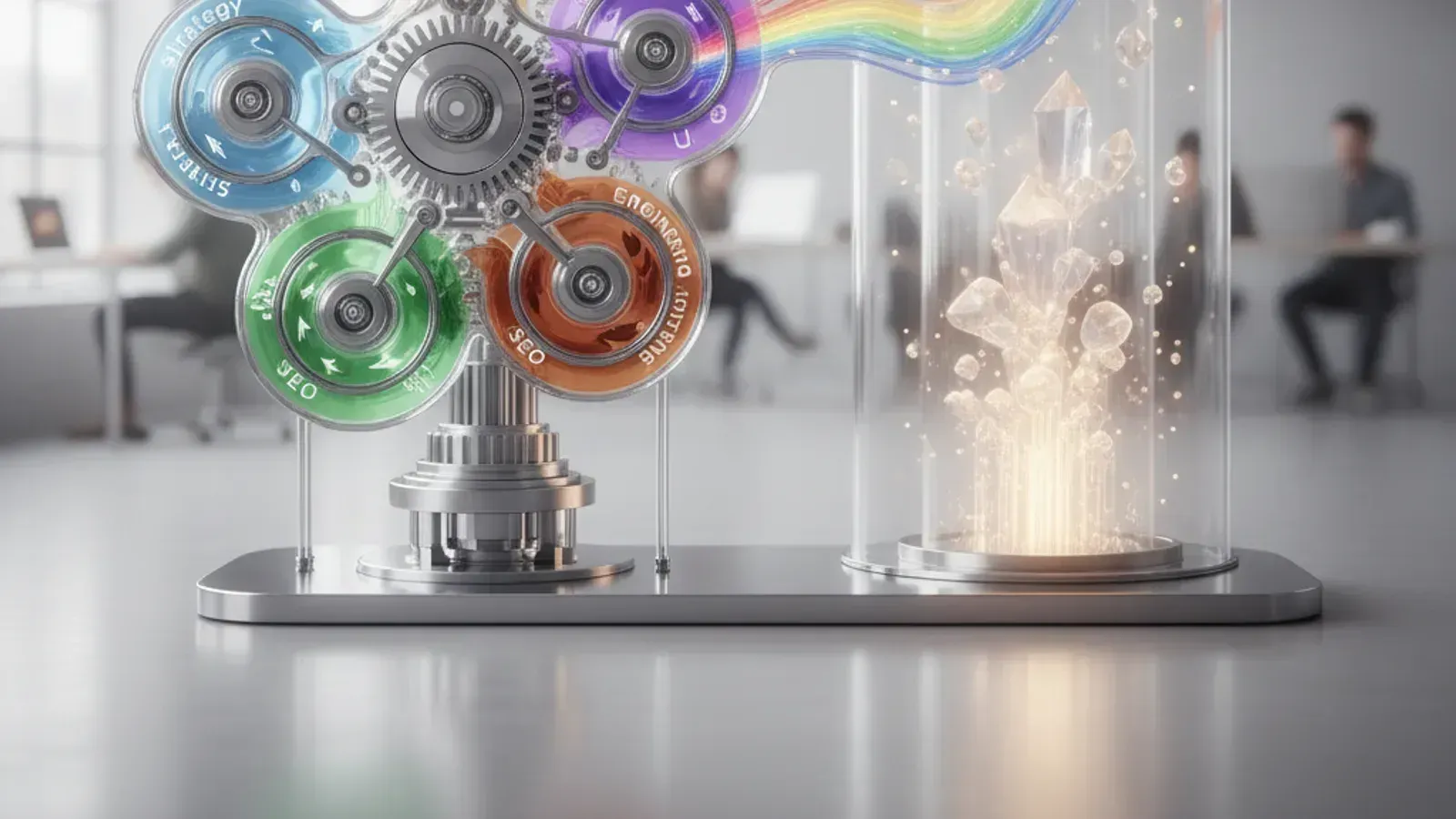
True conversion success requires a unified approach, where all disciplines collaborate seamlessly.
How to Audit Your Website Before Redesigning It
Before you embark on a costly redesign, take stock of your current website's strengths and weaknesses. A thorough audit can pinpoint exact areas for improvement and ensure your next steps are strategic and data-driven. This process helps you understand why your website looks good, but might not be converting.
- Business Goals & Value Proposition: * Is your primary value proposition crystal clear on every key page? * Is your target customer segment immediately obvious from your messaging? * Are your primary business goals (e.g., lead generation, sales, sign-ups) clearly defined and measurable for your website?
- User Experience (UX): * Can users find what they need quickly and intuitively? * Is the navigation straightforward and logically organized? * Are forms easy to complete, and are conversion paths clear and frictionless? * Is the website accessible to users with disabilities?
- User Interface (UI) & Branding: * Is the visual design consistent with your brand identity? * Does the UI effectively guide user attention to important elements (e.g., CTAs)? * Are there any broken links, images, or display issues across different browsers?
- Content & Messaging: * Does your content address your customers' problems and offer clear solutions? * Is the tone of voice consistent and engaging? * Are there compelling testimonials, case studies, or social proof?
- Technical Performance: * How fast does your website load on desktop and mobile (check Core Web Vitals)? * Is your website fully responsive and optimized for various devices? * Are there any technical SEO issues (e.g., broken links, crawl errors, missing metadata)?
- Analytics & Optimization: * Do you have analytics tools properly installed and configured (e.g., Google Analytics)? * Are you tracking key conversion events and user behavior? * Do you have a system for A/B testing and continuous improvement?
This audit will give you a clear picture of what's working, what's not, and where to focus your efforts. It transforms a subjective assessment of a "good-looking" site into an objective roadmap for a high-converting digital product.
Your website should be an engine for growth, not just a pretty face. If you're struggling to convert visitors into valuable leads or customers, Kraavon can help. We partner with founders and product teams to build digital products that look exceptional and deliver real business results, uniting strategy, design, and engineering.